
Lab Hay Al Matar
A Medical Laboratory Brand
Services
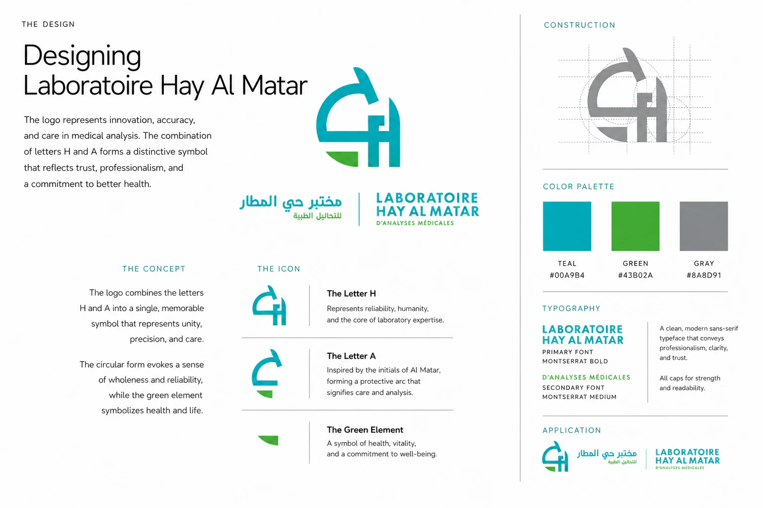
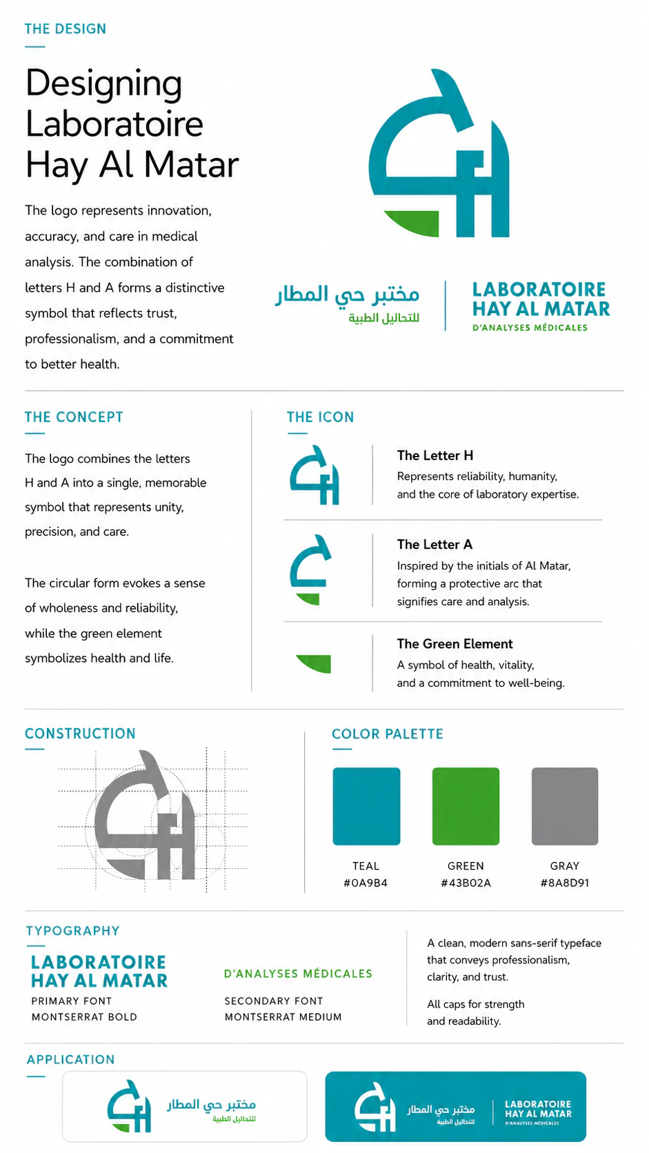
Brand Identity
Art Direction
Brand Identity / Art Direction
A brand that patients can believe in
The client partnered with us to establish a visual identity worthy of the trust their patients place in them every day. The vision was to build a medical laboratory brand that communicates precision, cleanliness, and human care—without feeling cold or institutional.
We crafted a complete brand identity—shaping every element from logo and typography to color system and visual language.
The result is an identity built to reassure patients, inspire confidence, and stand with authority in the medical community.
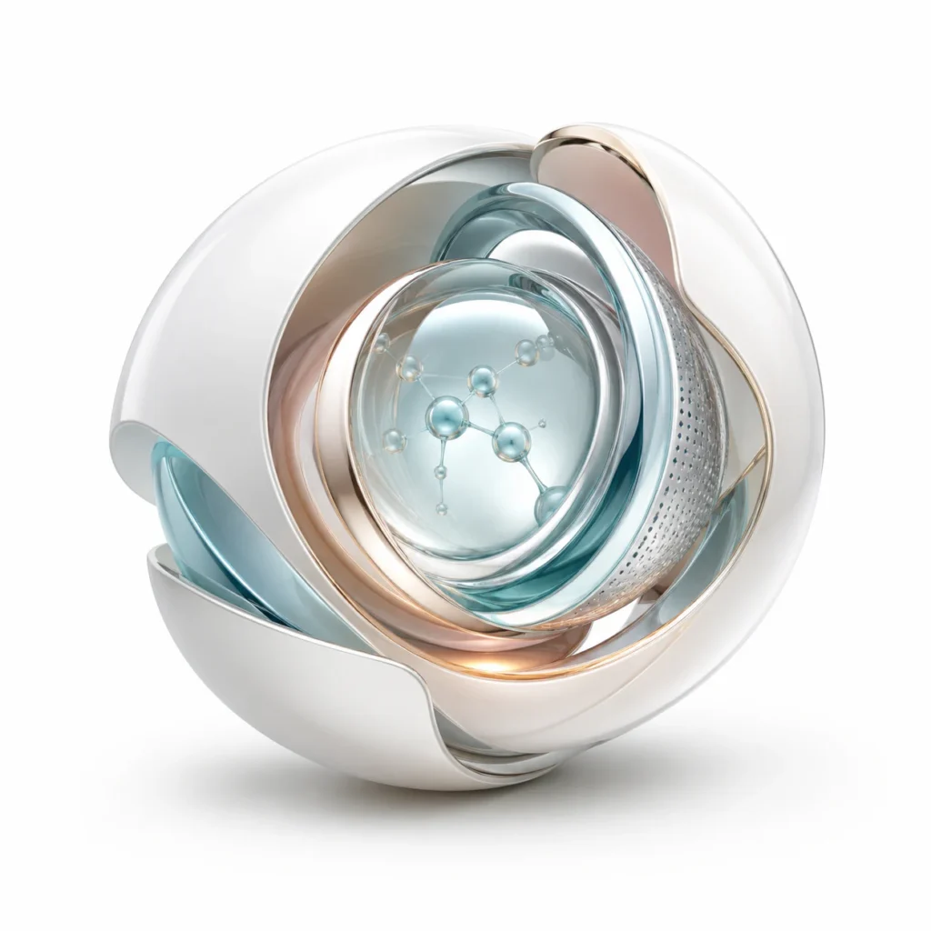
Science, care & trust
Rather than building a purely clinical brand, we shaped an identity that balances scientific rigor with genuine human warmth—because patients aren’t just looking for accuracy, they’re looking for reassurance.
Our strategy focused on positioning Laboratoire Hay Al Matar as a neighborhood institution: technically excellent, locally trusted, and deeply approachable.
The discovery
During research we found that patients choose medical laboratories based on two things above all else: perceived cleanliness and perceived competence. Both need to be communicated instantly, before any interaction takes place.
We learned that the brand needed to work across a wide range of touchpoints—signage, printed forms, reception materials, uniforms—and maintain its integrity and legibility across all of them.
This insight guided every decision in the identity system we built.
Clinical precision, human warmth
We intentionally moved away from the cold, sterile aesthetic that dominates medical branding. Instead, we built a visual identity rooted in calm confidence—clean without being harsh, professional without being distant.
The design language is clear, grounded, and quietly reassuring—an identity that puts patients at ease the moment they encounter it.
Identity built for the institution
The logo, color palette, and typographic system weren’t chosen for aesthetics alone: they were engineered to function across every surface a laboratory brand touches.
The precision of medical science shaped the visual structure. The care behind every test influenced the warmth of the palette. And the overall identity reflects the laboratory’s core promise: accuracy you can trust, delivered with humanity.